Analytics Fatigue: When More Data Means Less Insight
When data grows faster than understanding, clarity becomes the first casualty. Analytics fatigue is real — and it’s quietly limiting decision-making in even the most data-mature organizations.
The signs are subtle — but familiar
You’ve invested in a modern BI stack, launched self-service dashboards, and made data accessible across business units. Yet adoption stalls. Reports sit underused. Teams revert to familiar views. Decision cycles stretch. Metrics become justification instead of direction.
This isn’t a tooling issue — it’s a clarity issue. Analytics fatigue emerges when dashboards grow faster than decision confidence.
In the rush to become data-driven, organizations often become data-distracted. The signal gets lost in the noise.
When dashboards turn into background noise
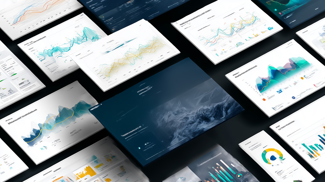
Dashboards were meant to democratize information. Instead, they often turn into cluttered interfaces. A monthly P&L dashboard might show everything from variance to forecast dips, but still leave leadership asking:
“Why is OPEX 12% over budget in Q2?”
More charts don’t equal more clarity. Without context, ownership, or prioritization, dashboards become visual archives — not decision engines.
Why fatigue happens
- Too many dashboards
- No hierarchy of importance
- Metrics not tied to decisions
- Overwhelming visual density
What users actually need
- Simplicity
- Context
- Actionable triggers
- Trustworthy metrics
From output to outcome
Getting past fatigue means curating, not expanding. Insight needs to be crafted, not accumulated.
- Design dashboards around outcomes, not datasets.
- Embed alerts or nudges into workflows.
- Define success to eliminate ambiguity.
- Retire dashboards that no longer serve decisions.
A healthcare provider replaced 75 dashboards with 8 curated decision views. Usage doubled, escalations fell, and review cycles shrank by 30%.